3DF Zephyr Beta - Road to Blueberry

Collapse
X
 
  • Time
  • Show
Clear All
new posts
  • Andrea Alessi
    3Dflow Staff
    • Oct 2013
    • 1334

    3DF Zephyr Beta - Road to Blueberry

    New beta, new thread!

    Feel free to use this thread to discuss bugs, features or anything else related to the next version, codename Blueberry.

    Status reports:

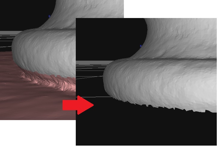
    Yesterday (November, 8th, 2018) we released the first beta version of the upcoming 3DF Zephyr update, codename Blueberry. While you can follow the development on the dedicated forum thread and on the unofficial 3dscanninghacks wiki dedicated page, we also would … Read More


    Wiki: https://www.3dscanninghacks.com/wiki...tus_(Blueberry)
    Last edited by Andrea Alessi; 2018-11-09, 04:02 PM.
  • cam3d
    3Dflover
    • Sep 2017
    • 681

    #2
    Woooo! Multi-threaded colour based mask generation!

    Comment

    • yoli
      3Dflower
      • Sep 2018
      • 9

      #3
      Hi, a few issues I have found so far in build 2018.11.08.16.50.58:
      - bounding box side does not turn red anymore when intersecting with point cloud (like on scaling the bounding box)
      - mesh export paths default to C: instead of the last location used (or location of the .zep file)
      - Textured Mesh Export dialog is not saving parameter selections
      - the new Speed Up Level parameter for dense cloud generation does not have documentation
      Last edited by yoli; 2018-11-09, 08:55 AM.

      Comment

      • sam3d
        3Dflourished
        • Feb 2018
        • 98

        #4
        Is this an open Beta?

        Comment

        • Roberto
          3Dflow
          • Jun 2011
          • 559

          #5
          Yes, just send a request to support@3dflow.net for a key!

          The beta period usually lasts 2-3 weeks or unless we finished fixing all the known bugs and issues

          Comment

          • sam3d
            3Dflourished
            • Feb 2018
            • 98

            #6
            Can higher resolution toolbar icons be included for 4k screens?

            Comment

            • Roberto
              3Dflow
              • Jun 2011
              • 559

              #7
              New beta up (v. 4.120):
              - Added missing parameters descriptions
              - Setting animation duration doesn't take forever
              - Fixed polyline and surfaces icons
              - Added colorspace quantization on multispectral viewer
              - Improved orthophoto generation algorithms
              - Many minor tweak and fixes

              sam3d you can set the size from application / appereance (at the moment it's cap at 32x32, would you like an higher size?)

              Comment

              • ZazMMM
                3Dfollower
                • Nov 2018
                • 13

                #8
                Is the removal of the selection tools from the toolbar intended, or perhaps temporary ?

                I expect a lot of my current use falls outside the norm as I've been messing with pretty bad data that requires a lot of manual cleaning, so I could see why this might be acceptable to others. However, it seems like a step backward in usability.

                If they were available via hotkeys, I wouldn't miss the icons on the toolbar. Being a long time user of blender, and other similar packages, hotkeys are second nature to me.

                Comment

                • Roberto
                  3Dflow
                  • Jun 2011
                  • 559

                  #9
                  The icon bar was becoming a little cluttered, and since we have introduced other icons for the selection, we decided to move it on the right dock. It's still temporary, and probably it will be moved above the "drawing" box (that is available only in the aerial version). We also added the filters there

                  Click image for larger version

Name:	right.JPG
Views:	799
Size:	164.6 KB
ID:	3756

                  Comment

                  • sam3d
                    3Dflourished
                    • Feb 2018
                    • 98

                    #10
                    I tend to use the 16x16 size to reduce the icon bar footprint/clutter. The icons look best at 24x24 but are larger than I would ideally choose.

                    It's no issue and perhaps just due to display scaling in Win10 but some of the icons look a bit pixelated on my 4k screen at 150%.


                    I also use the Selection Tools a lot - editing probably represents the longest part of the process in terms of actually interacting with Zephyr for me although I'm just using the Lite version normally.

                    Consolidating tools to a dedicated Editing Panel sounds like a good idea. Perhaps the 'Select' sub options could ultimately move to the Editing Panel too?

                    Comment

                    • ZazMMM
                      3Dfollower
                      • Nov 2018
                      • 13

                      #11
                      Roberto OK, I see them now. I had actually closed that panel in Lite as I preferred a bigger viewing area for point clouds and meshes, so I didn't even look at what was there on the right. An Edit panel is certainly more convenient than going to the menus all the time.

                      I would find it better if you could fully utilize QT's ability to dock and split panes. Maybe I just don't know QT's paradigms good enough, but I would expect to be able to split panes and move things around to create a UI similar to the attached image (hacked together in GIMP). While I can move the Edit panel to the left side of the screen, I can only get it to be a member of the tabbed pane that has the Project, History and other panels.

                      The Edit panel comments aren't a big deal for me. I can always undock the panel and make it small when I'm using it and then hide it when I'm not. And if at some point hotkeys are added for the selection functions, I'd never see the edit panel again.

                      On the icons and screen resolutions, my company ran into the same problem on a Java app we sell. We converted all of our icons to SVG images to solve the problem. SVG will scale to whatever resolution you want without pixelation as long as there are enough pixels available to adequately represent the icon.

                      I see you renamed the camera menu items and added hotkeys for the camera views, thanks.
                      Attached Files

                      Comment

                      • svfx
                        Blossoming 3Dflower
                        • Nov 2018
                        • 1

                        #12
                        seosvfx
                        SVFX animation studio, animation studio in pune
                        Last edited by Andrea Alessi; 2018-11-14, 11:53 AM. Reason: link removed

                        Comment

                        • Andrea Alessi
                          3Dflow Staff
                          • Oct 2013
                          • 1334

                          #13
                          Hi svfx,

                          please use this thread to discuss the current beta only, thank you!

                          Comment

                          • Roberto
                            3Dflow
                            • Jun 2011
                            • 559

                            #14
                            ZazMMM, I need Filippo for the qt part

                            I don't think that other dock area can be added so easily, but I might be wrong

                            Comment

                            Working...